TLDR; Even simple changes can use step by step risk based development to allow multiple releases, and will require multiple levels of testing.

My website is in a constant state of flux - that’s the benefit of writing it all by hand.
Today I wanted to add nifty social media icons on the page because I hear tales that there is gold to be made from the contacts that come from such things. And never one to turn my back on boundless riches, I wanted to add some social media and contact icons.
And why tell you this?
Because:
- the testing process around this has relevance
- I learned something about CSS and I assume other people might like to learn that too
All I Wanted was some social media icons
![]()
I wanted them in the top right of the page, and on the bottom of the page.
How hard could it be?
Start by mitigating technical risk in small chunks.
First off:
- I don’t have any icons
- I don’t have any links
I’ll start with the footer and create the icons and links and make sure they work.
- create a div with the icons in a row
- view it on screen and check that they render
And this is where the first set of errors starts.
For some reason I decided to miss out some closing " on the src attributes.
- Did the browser complain? No.
- But it did render incorrectly. When I view the page I see every second icon.
At least the browser offered me a ‘clue’ that there was something wrong to someone as observant as I.
An easy fix.
All good.
They need to be links. So wrap them with <a></a>
And for some reason, I miss off the closing " on one of the links.
- Did the browser complain? No.
- Did it render incorrectly. No.
- But it didn’t direct me to the expected pages when I clicked on the links.
At least the browser offered me a ‘clue’, during my interaction, that there was something wrong to someone as observant as I.
They need some semantics.
I wrap them in a div and provide them with a class of social-media-icons
All good.
And with the footer icons done, I can now move to the next level.
Add them to the top right of the screen
I left this to the end because I knew I’d need some CSS trickery to get them in the top right.
But oho. I know CSS, all I’ll have to do is wrap them with a <div class="topright">
And that would look something like this:
.topright {
    position: absolute;
    top: 0px;
    right:10px;
}
What could go wrong?
As a tester, you can play along. Given the above spec and technical information… what could go wrong?
What went wrong?
Turns out:
- yes, absolute does position absolutely
- yes, 0px puts it at the top
- yes, 10px is offset from the right
And a less observant person than myself might have left it there. But I test stuff and things.
And testers don’t just, size the window smaller to make sure the page renders at different sizes.
We size the windows bigger too.
And, sadly, I learned that my CSS knowledge was incomplete.
I had indeed positioned them in the top right, but instead of being in the top right of the header div, they were in the top right of the page.
How?
There was a clue in the CSS positioning reference that I looked at.
An element with position: absolute; is positioned relative to the nearest positioned ancestor (instead of positioned relative to the viewport, like fixed). However; if an absolute positioned element has no positioned ancestors, it uses the document body, and moves along with page scrolling.
Obvious.
But not to me.
I had to search a few Stack Overflow answers until I found someone that wrote in terms that I understood.
Note, that the position is dependent of the first ancestor-element which is not
staticpositioned!
Oh of course.
By default an element is static positioned. I know because it says so on the CSS reference I consulted:
HTML elements are positioned static by default.
My header is static positioned, so I need to wrap the icons in something which is not static positioned in order to position it absolutely.
OK, so I did that. The enterprising testers among you can inspect the social media icons at the top of the page to see the hack that I created.
And lo, after a few small margin tweaks
.topright img{
    margin-left:1em;
    margin-right:1em;
}
I was done.
Time to release.
I suppose I better check mobile just in case
I view CSS positioning as potentially having a risk on different browsers, therefore I want to see this render on different browsers.
A quick trip to “Al’s Responsive Test Tool” and view it on " Apple iphone - X: 320 Y: 480 "
Curses.
![]()
That overlapping nonsense wasn’t quite the effect I was aiming for.
So what sizes did this work at? I need to know the px so I can write a media query.
Jump into the Chrome Dev Tools and use the Device Toolbar.
And after a few binary chops of x values I decide that 440px is the maximum I will allow the icons to absolute. If we are below 440px then I will static.
Because I styled with classes it was an easy fix to add a media query.
@media only screen and (max-width: 440px) {
    .topright {
        position: static;
        top: 0px;
        right: 0px;
    }
}
And… release.
I suppose I should double check the validation
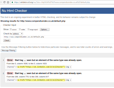
And one final check using validator.w3.org

What? Seriously?
- Did the browser complain? No.
- Did it render incorrectly? No.
- Did it incorrectly direct me to the expected pages when I clicked on the links? No.
A distinct lack of clues in the browser then.
And I remember:
- code reviews are fallible
- browser rendering protects you from your own mistakes
- browsers lie
Sure enough, I had missed a </a> from my youtube link.
And this flew through my:
- manual link click testing. I clicked on all the links and they worked.
- my cross browser rendering testing. I saw no obvious issues
And another fix, and release later and I have a set of social media icons.
And - for those of you that visit my site regularly, there is the risk the CSS you have cached in your browser will not update on this visit, so you will see the icons at the top left, rather than the top right. I have accepted this risk. The CSS augments the HTML so even with no CSS styling the icons they don’t look that bad, and then you’ll have a nice surprise when you hit F5 to reload the page and CSS.
Lessons
- Gaps in our knowledge are a source of bugs
- Tools can help us find some bugs
- Even simple fixes require careful observation
- Using
divandclassallows later fixing and tweaking through CSS alone - Use Multiple tools. I used:
- validator.w3.org
- Al’s Responsive Test Tool
- Chrome Dev Tools - Device Toolbar
- There is always a need for multiple references on the same topic, because people understand things at different levels
- and that is why you should blog
- and this is why I wrote this post


